Background
Tanaka contours, also known as illuminated contours, are a unique way of visualizing elevation. Tanaka Kitiro (developer of said method), used light from a northwesterly direction and varying line width & color based on the line’s angle.
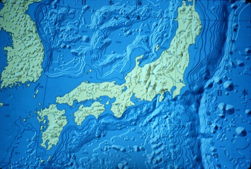
This guide is an adaption of Anita Graser’s excellent guide to creating Tanaka contours in QGIS. Here, I will show how to accomplish the same thing in ArcGIS Pro (with some notes on data preparation).
Select a Location
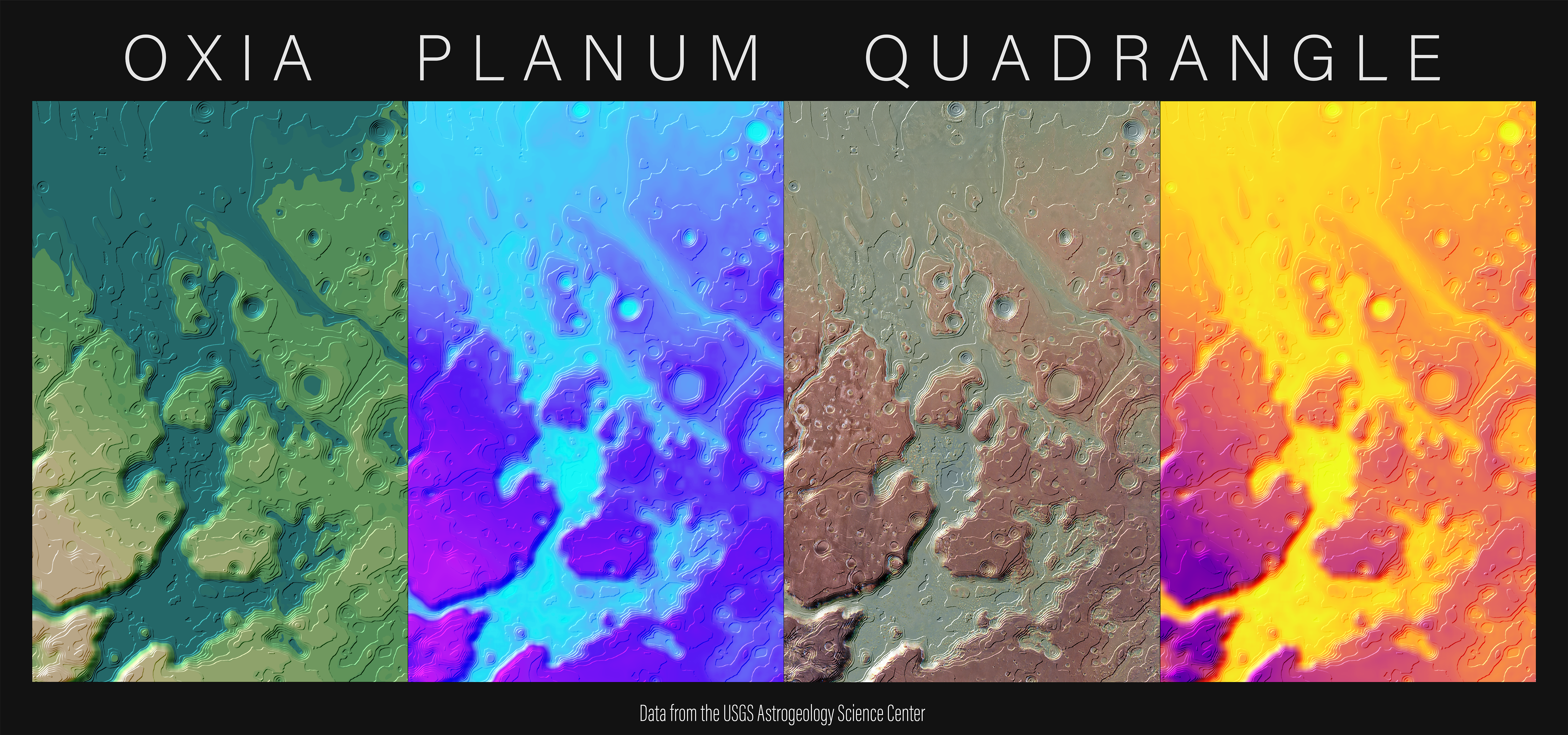
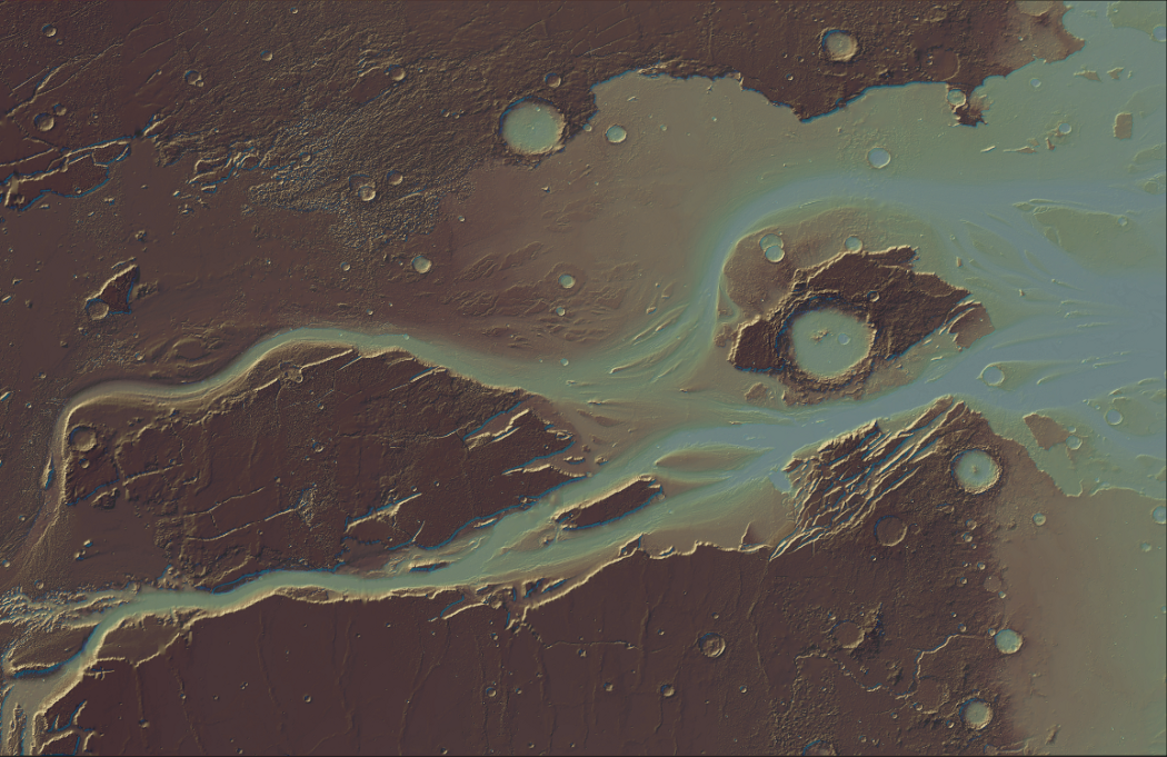
First, find an area where you want to create contours. For me it was Kasei Valles on Mars.
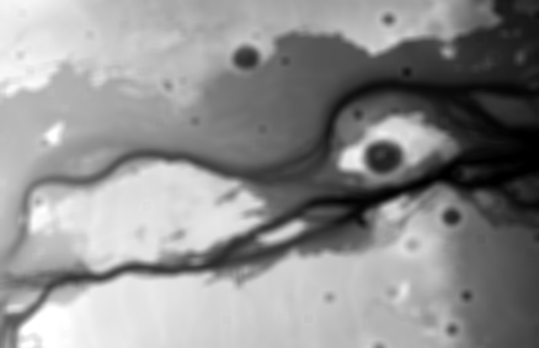
If you’re curious why Mars looks this way, I used John Nelson’s custom Imhof Style on a 200m DEM of Mars (from the USGS). Sure, Mars doesn’t have the lush landscape of Switzerland, but it looks pretty neat!
Clipping the Raster
This isn’t strictly necessary, but it will help speed up processing down the road. This can be accomplished via the Clip Raster tool in ArcGIS Pro, or through this GDAL command (in this instance, it said my source and target ellipsoids were not on the same celestial body, which was strange because both were in the same projection).
gdalwarp -cutline clip.shp -crop\_to\_cutline mars.tif kasei.tif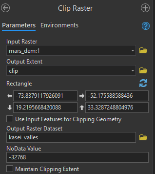
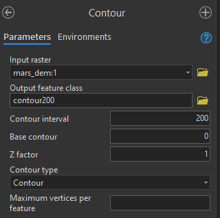
Creating Contours
This could be as easy as this GDAL command
gdal\_contour -a elev input.tif output.shp -i 200.0While this will create accurate contours, I’m looking for something smooth and aesthetically pleasing. In order to create smooth contours, the DEM needs to be generalized (this is possible with some more GDAL commands and maybe some Python, but I’m not going to go into that here).
In ArcGIS Pro, the DEM needs to be run through the Focal Statistics tool. Depending on the size of the DEM and the scale you are working with, your width and height parameters will be different. Play around with the settings until you find something appropriately smooth.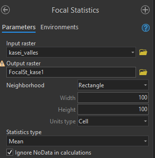
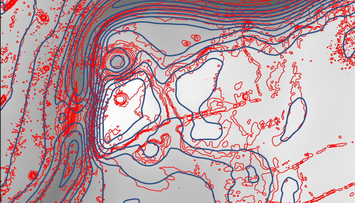
The contours created with the smoothed DEM look a lot better than the ones created with the raw DEM. The contour interval for others will depend on the scale of your layout (mine is approximately 1:3 million).
Calculating the Azimuth, Color, and Width
Since line color and width is dependent on a line segment’s azimuth, the line needs to be split by its vertices. This can be accomplished through the Split Line at Vertices tool in Pro.
After the contours have been split, I added three fields (all with the type float): azimuth, width, and height.
For the azimuth calculation, open up the field calculator on your split contours and call the following code block with get_azimuth(!Shape!) on the azimuth field:
This code was adapted from the QGIS function azimuth().
For the color calculation, create another field and call the following code block with get_color(!azimuth!):
This is to make it look like the sun is based in the north west (-45°).
The width calculation will be similar in concept. Line segments that are in the sun or shadow will be thicker, while those in the orthogonal direction (meaning at right angles) will be thinner. Call the following code block with get_width(!azimuth!)
Styling the Map
Click on the processed contours, select the Appearance tab, and set the Layer Blend to Overlay.
With the contours still selected, go to the Symbology pane, navigate to Vary symbology by attribute, and set the Color field to color and the Size field to width.
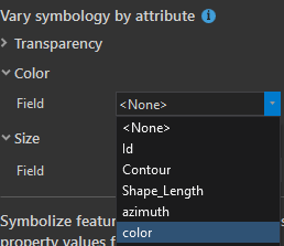
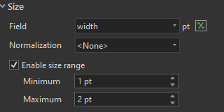
The default for the color ramp is acceptable, but in the Size area, check the Enable size range checkbox, and set the range from 1pt to 2 pt (or however thick you would like your lines).
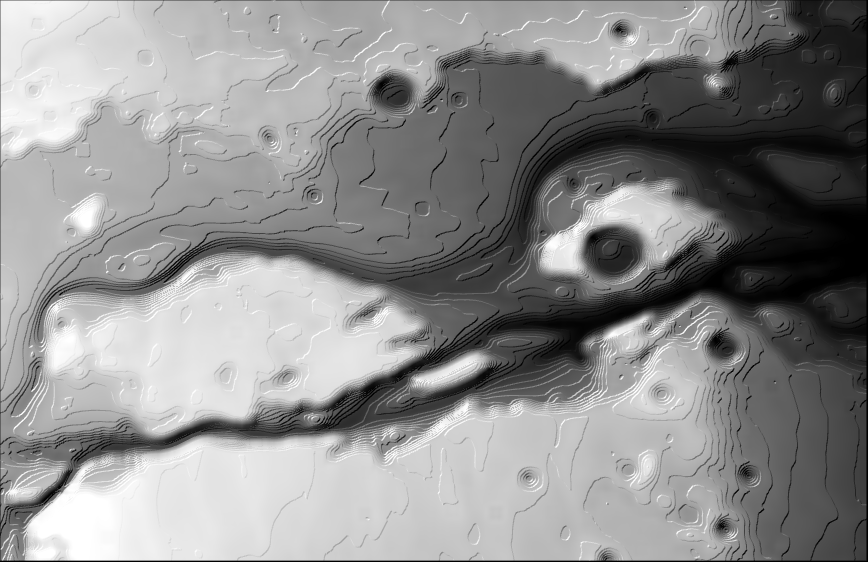
Then, assuming your blurred DEM is still the back-drop, your map should look like this:
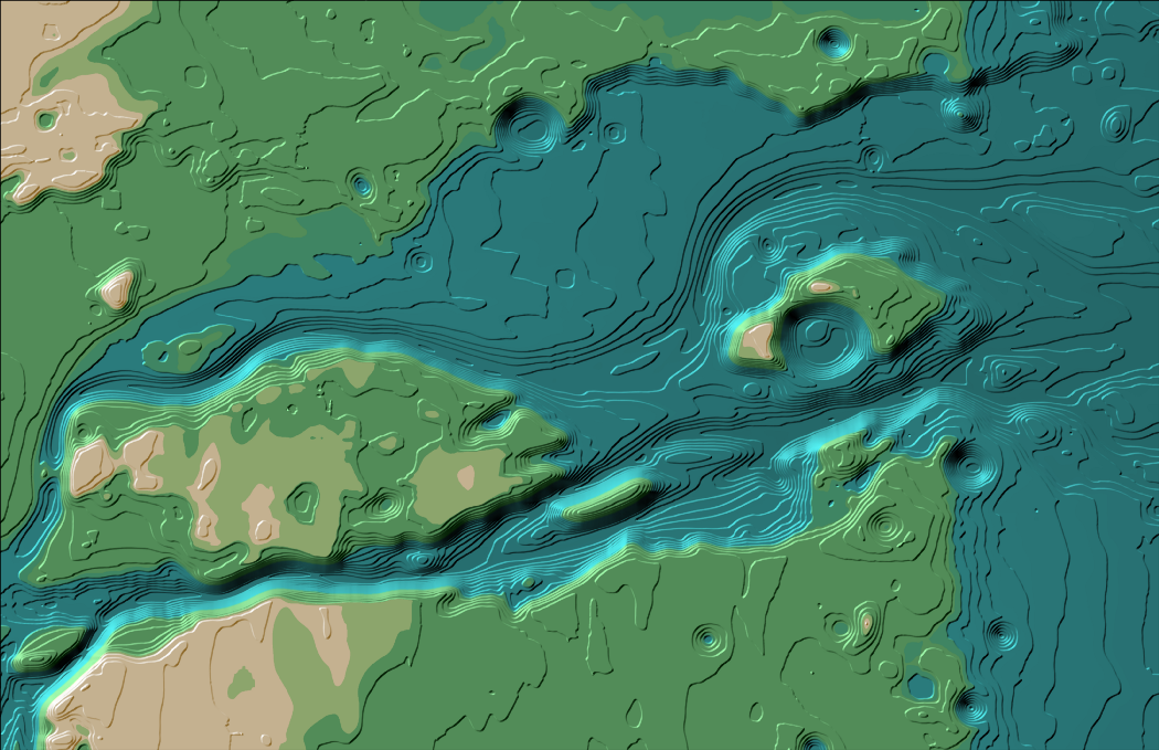
Mess around with the color ramp on your DEM to get the look you’re going for. I tried one with an “earthy” look to it:
That’s all there is to it. This workflow can be repeated anywhere and adjusted to your liking. Thanks for reading.